
Ever wonder why upscale restaurants place so little food on their plates. These establishments want you to focus more on the quality of the meal instead of satisfying your hunger.
When designing it is important to think about hiearachy; that is having clear distinction between the information you deem important from your secondary read.
Welcome back to Pineapple Academy. This is our 3rd installment of our weekly series on Brand Identity Design. Our goal is to help small business owners create engaging publications and/or improve their existing designs. In this month's newsletter we're talking about Negative Space, an often overlooked topic.
Negative Space is simply the areas or "white spaces" in between and around the images and information in your publication.
Ok so you're trying to make a flyer to post on your social media to advertise your services. The example above is the result of back-to-back nights of head-scratching and nitpicking.Honestly there's nothing wrong with the layout of the flyer but nothing catches the eye and it seems a bit congested. Implementing negative space can help create flow and breathing room within the design.

Margin is the area between the main content of a page and the page's edge. Your eye should be able to move around the page freely, therefore, avoid designing at the edge of the page. An easy way to add margin to your layout is simply by scaling down your content.

Notice how the text and the image are the same width. For this layout we want the readers to focus on the text so we will provide separation by changing the shape of the image from a rectangle to a circle which decreases the width substantially.
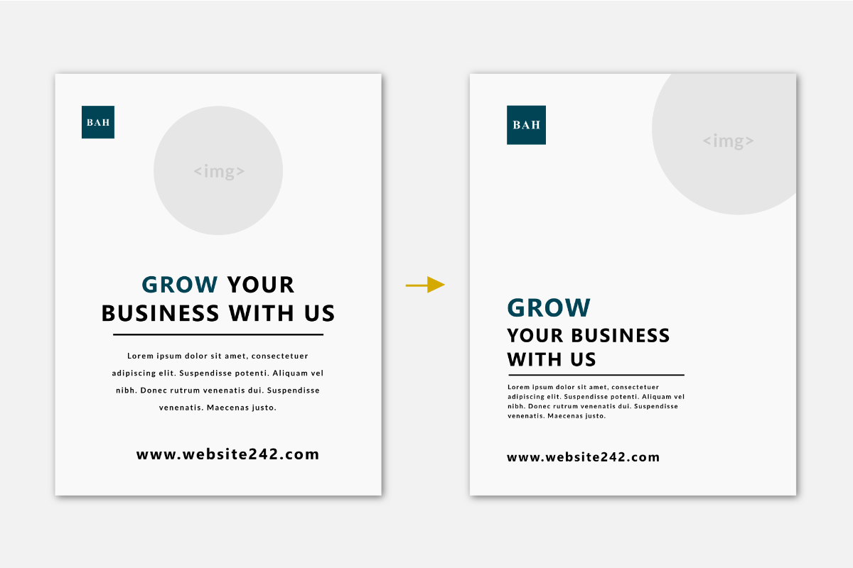
Avoid center aligning your content and specifically when dealing with text resist the urge to justify align your paragraphs. Although sometimes the margins may mathematically be the same, to your brain justifying left or right can feel more spacious.Our minds have been accustomed to scanning layouts from left to right. When we center or justify our layouts we are creating a “fork in the road” and our brain struggles to choose a direction. By aligning left or right we allow only one path and we take out decision making that distracts from our design.

Pineapple Prints redefines what’s possible with local promotional marketing, we manufacture premium stationarery and custom packaging in-house for Bahamian Businesses; satisfying their need to look unique yet professional.