.jpg)
Welcome back to Pineapple Academy, where we break down essential design principles to help Bahamians build strong, recognizable brands.
This week’s lesson is all about contrast—one of the most important tools in design and marketing.
Contrast is what makes your designs interesting and easy to understand. Without it, everything blends together and your audience doesn’t know where to look. When used correctly, contrast helps guide attention, highlight key information, and make your marketing more engaging.
Simply put, contrast keeps your brand from looking flat or forgettable.
Size is an easy tool to implement contrast in your design that is often overlooked. Specifically, using different sizes of fonts can bring attention to the topics you want your readers to really focus on and gives depth and character to your publication.
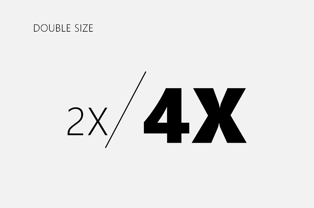
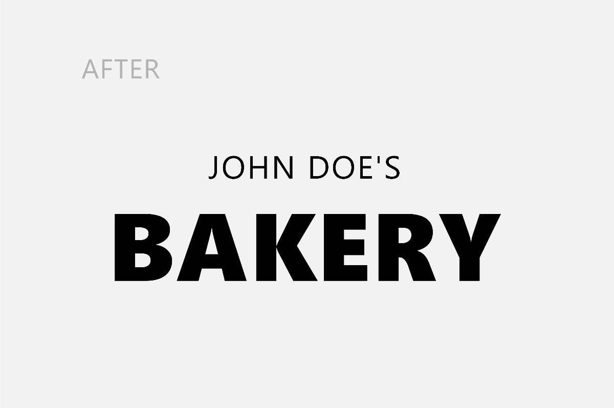
A common theme you will see throughout this lesson is the emphasis on making noticeable differences in your design. Size is no different. In his Typography Manual, Chris Do, an Emmy award winning designer points out that you should at least double or half your point-size when changing between sizes.
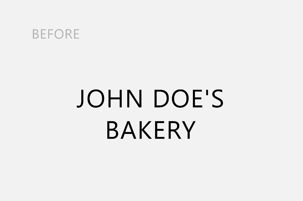
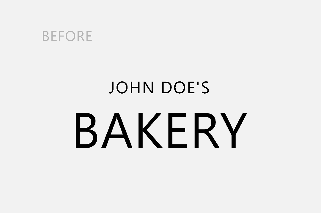
Here we have two examples, one where the font-size are the same and one where the font-size is three times as big between the fonts. Changing the size of the word bakery creates a difference in the design (contrast), and attracts the reader's attention first.
Another way to create contrast with typography is by adjusting the weight. Weight simply means how thin or thick your font is.
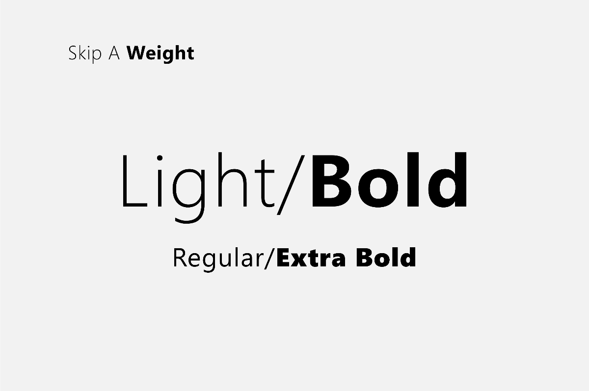
Remember that award winning designer we spoke of earlier? It so happens that he has another tip for us on this topic in his manual on 'type'. (If you haven't checked it out by now: https://thefutur.com/resources/typography-manual) Chris Do suggests this time that we skip weights. He states that slight changes in weight makes it difficult for the reader to notice the difference.
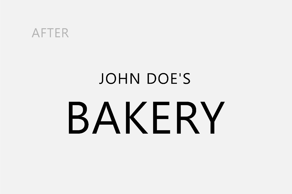
In the examples below, the first design we created earlier by drastically altering the size of the fonts, however, the weight of the fonts are the same. The second example we started with the font-weigh as normal and changed "bakery" to extra bold. I think we can agree that this business owner's customers won't be confused about what services they offer.
Value or Tone is the relative darkness or lightness of a color or hue. The greater the difference in value the greater the contrast.
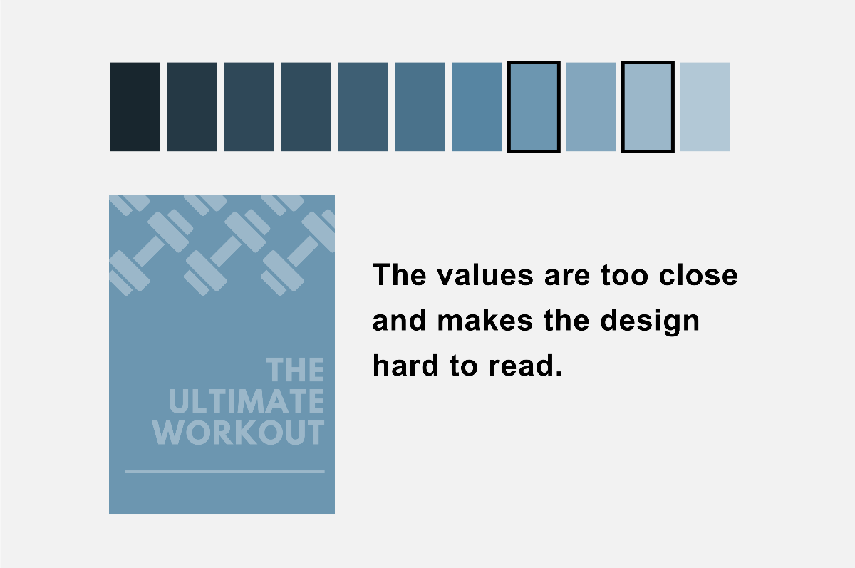
Let's say you're making a poster to advertise in your fitness gym and the above is what you came up with. You're hyped because you have an amazing poster to frame on the gym's wall despite design not being your strong skill. Now you want to explore ways to improve on this design. You may experience after printing the poster that close up it looks fine but at a distance it's a bit difficult to read. So what's our patented tip to help you?
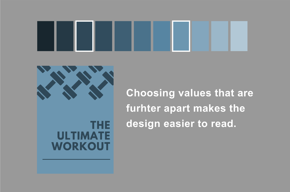
Like before with choosing weights for our fonts we learned that slight changes are difficult to notice. The same principles apply with choosing tones for your colors. If you want your design to pop off the page then choose tones on the opposite ends of the spectrum.
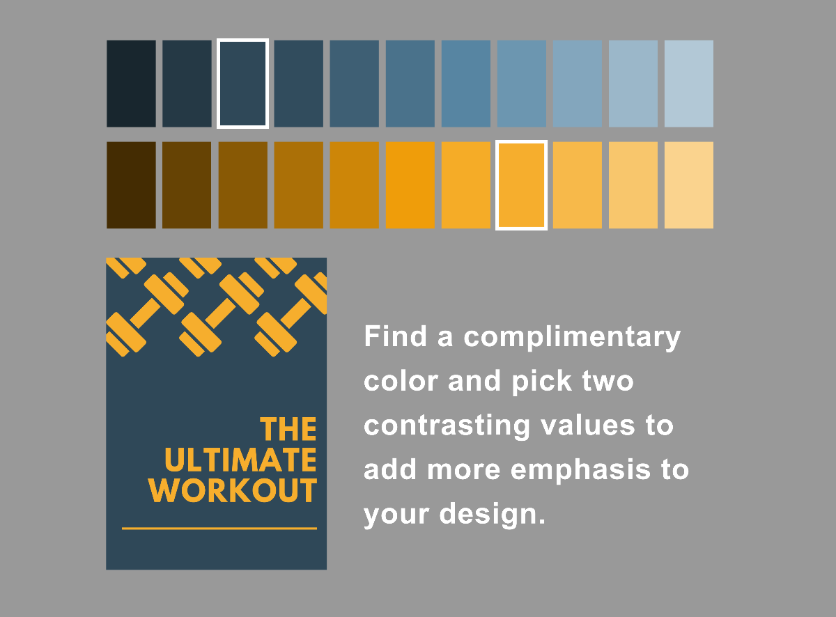
Create a more eye-catching design by introducing another color into the mix and implementing the same principles. You now are contrasting like a pro and your poster gets people to pause and appreciate it.
Pineapple Prints redefines what’s possible with local promotional marketing, we manufacture premium stationarery and custom packaging in-house for Bahamian Businesses; satisfying their need to look unique yet professional.