
Welcome back to Pineapple Academy—where we break down design concepts to help Bahamians create iconic brands.
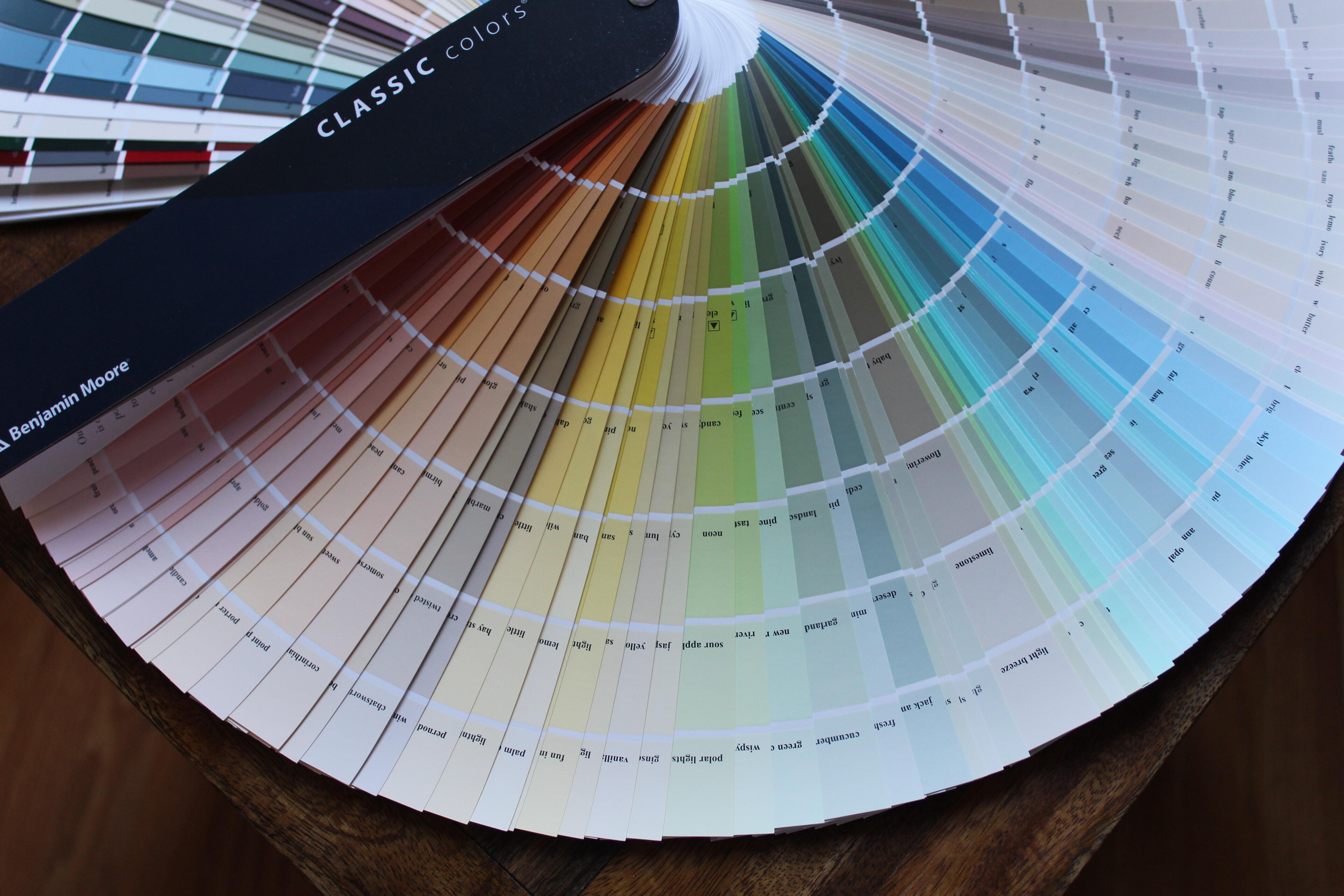
If you’ve ever struggled with choosing colors for your brand, you’re not alone. For many business owners, color doesn’t come naturally. Without a system, it’s easy for branding to feel unbalanced or end up looking more like a fast-food mascot than a premium brand (unless, of course, that’s exactly what you’re going for).
The good news? You don’t need to be a designer to use color well. You just need a recipe.
Color isn’t just about what looks nice—it’s about balance. Too many bold colors competing for attention can make your brand feel chaotic, while too little contrast can make it forgettable. Color proportion helps you stay consistent and visually pleasing across everything from packaging to social media.
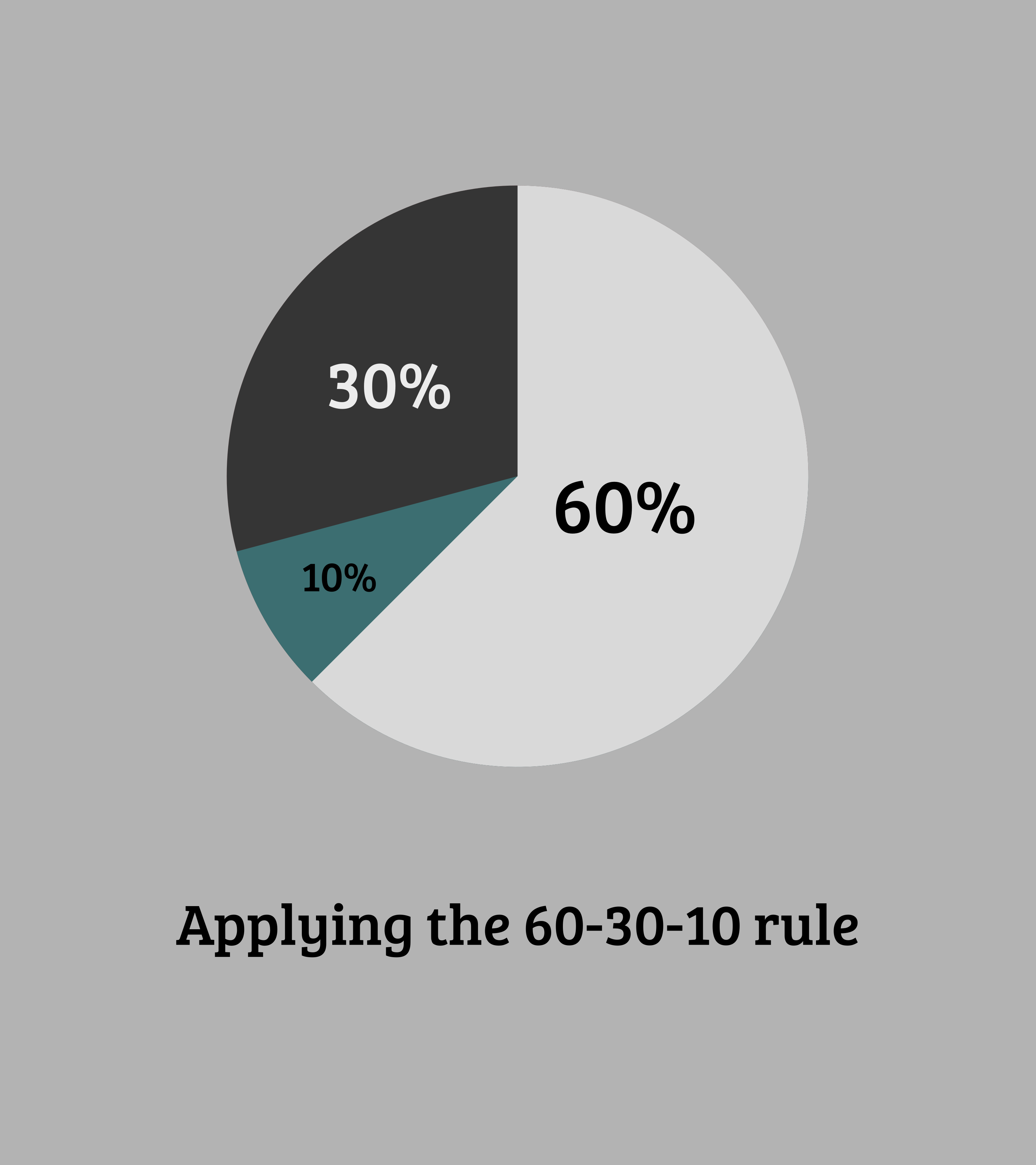
One of the most commonly used design principles is the 60/30/10 rule. Designers use this ratio to create harmony and structure in their work.

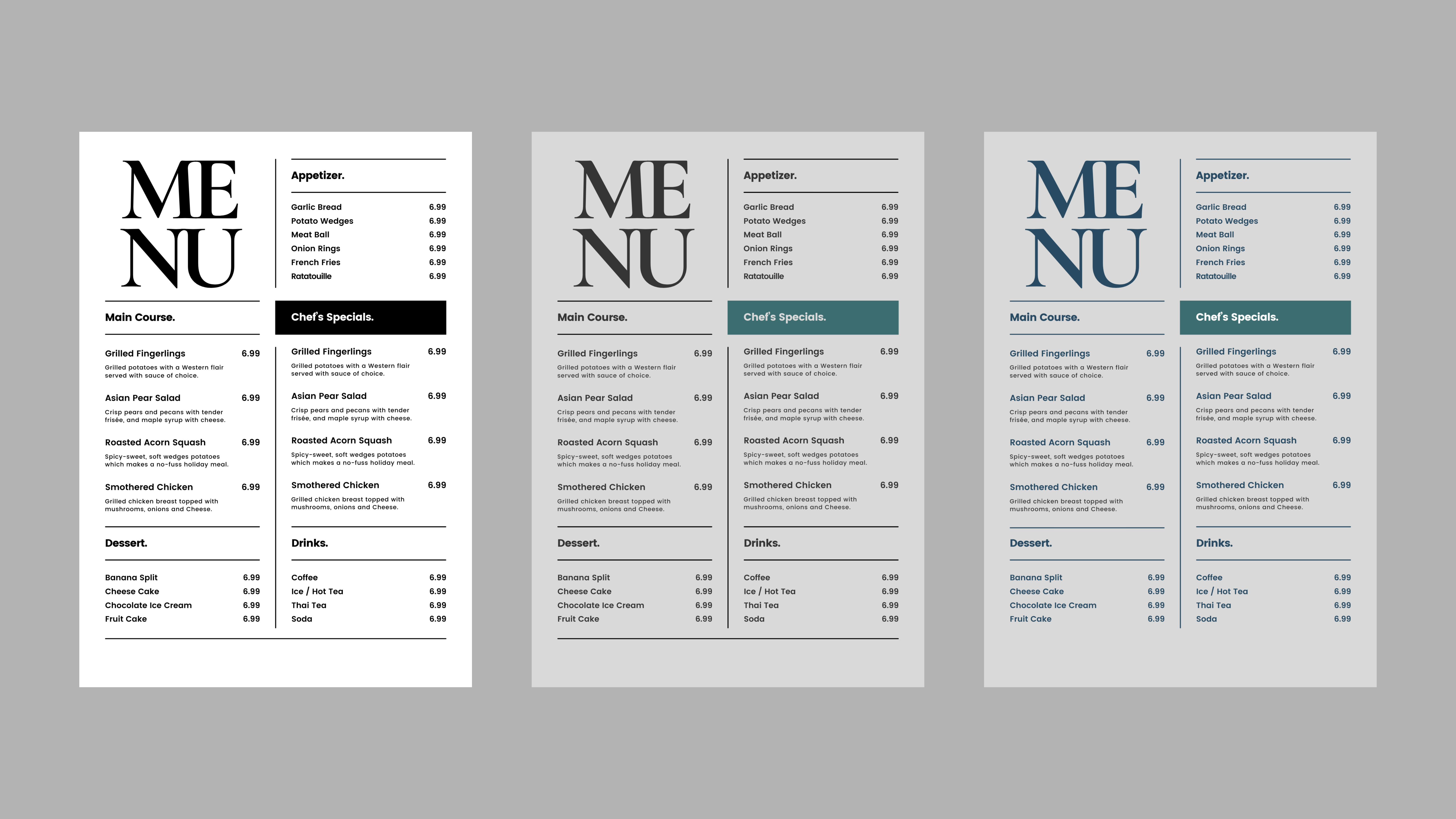
Out of the three colors here, the Light grey will be our primary color, the dark grey our secondary and the green our accent.


To give your designs another layer or some dimension, you can add more colors to your palette.


Pineapple Prints redefines what’s possible with local promotional marketing, we manufacture premium stationarery and custom packaging in-house for Bahamian Businesses; satisfying their need to look unique yet professional.